Quizell Brand Assets
In early 2021, we noticed a growing problem faced by thousands of modern brands: they were attracting visitors, but struggling to convert them - simply because they weren’t asking the right questions at the right time.
Explore Quizell BrandingLogo
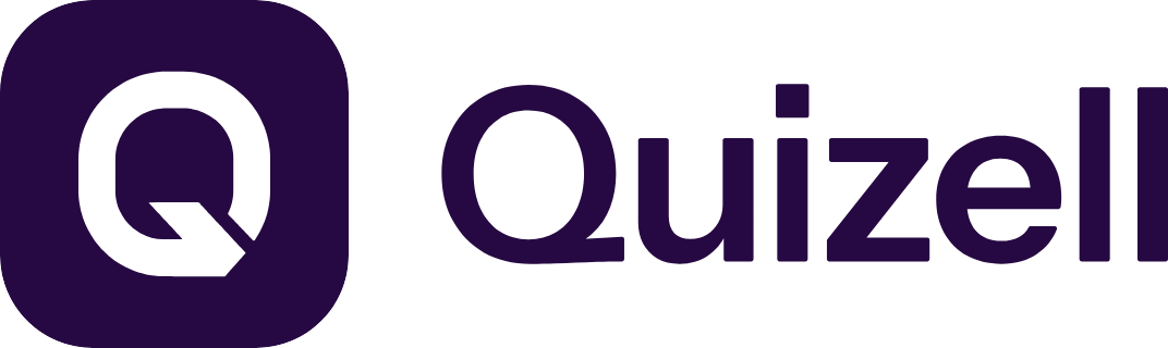
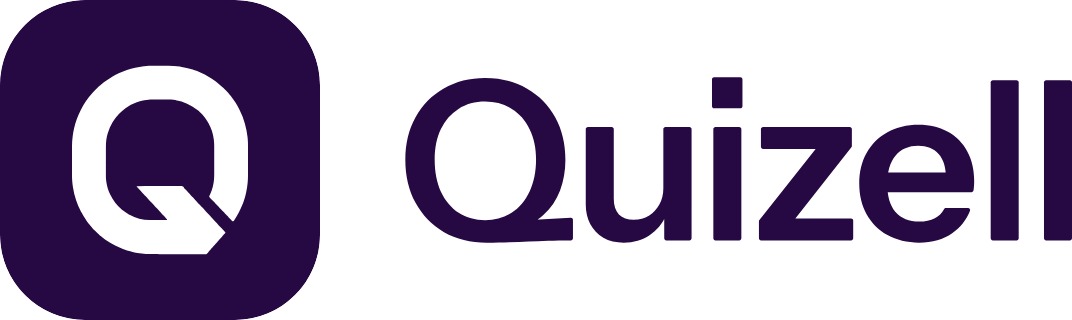
The Quizell logo is playful, approachable, and energetic - just like the product itself. The clean curves and bold simplicity reflect the spirit of accessible innovation. We wanted it to feel like something you could trust instantly, but that still carried personality and joy.



There’s also a small visual easter egg. The “Q” has an arrow-like pointer integrated into it representing the power of asking the right question, and the magic that happens when people engage. It’s our quiet reminder that a quiz isn’t just data capture - it’s a moment of connection.
We use this logo in white or full color depending on the context, always maintaining contrast and clarity.
Colors
Our color palette is built around confidence and clarity balanced with fun, imagination, and a hint of mystery.
Quizell Purple
Deep Indigo
Night Graphite
Lilac Glow
Background Accent
Together, these colors create a digital-first identity that’s expressive but usable. Nothing feels generic, yet everything feels intuitive.
Typography
We use Host Grotesk as our primary typeface - geometric, modern, and versatile.


Host Grotesk
It’s a font that speaks clearly but with charm. The rounded edges of Poppins reflect the rounded friendliness of the Quizell UI. And because it’s available across platforms, it keeps our brand consistent at every touchpoint. The combination of simplicity and structure in our font choice echoes our product philosophy: powerful tools made easy.
Design Philosophy
Quizell is built for humans first. 💜
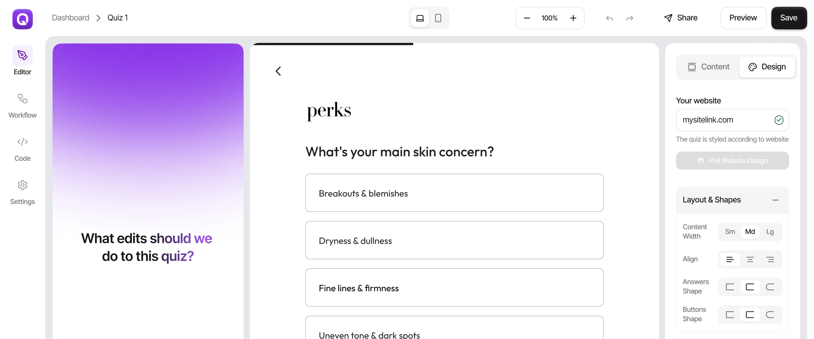
We wanted a visual language that didn’t feel too "SaaS-y" or over-engineered. That’s why we focused on round shapes, vibrant gradients, and whitespace. The UI breathes. It invites interaction. Nothing is stiff or cold.
We’re here to help people create experiences that feel fun and personal - not sterile. The brand reflects that mission.